Color blocking is like the art of using a jigsaw puzzle, but instead of puzzle pieces, you use solid blocks of different colors. It’s a technique that combines two or more distinct colors to create a striking, eye-catching effect. This method is not just about throwing colors together; it’s about creating harmony and balance, making a bold statement with simplicity.
This article will take you on a colorful journey, exploring the world of color block graphic design. Whether you’re a budding artist or an experienced designer, there’s something here for everyone. So, let’s add some color to our lives!
- The History of Color Blocking
- Why Use Color Blocking?
- Key Principles of Effective Color Blocking
- Choosing the Right Colors for Color Blocking
- Complementary Colors in Color Blocking
- Color Blocking in Web Design
- Impact on Viewer Psychology
- Challenges in Color Blocking
- Tools and Resources for Color Blocking
- Case Studies: Successful Color Blocking
- Tips for Beginners: Navigating the Color Blocking Universe
- The Future of Color Blocking in Design: A Glimpse Beyond the Horizon
- Conclusion
- FAQ
The History of Color Blocking
Color blocking is a design technique with a rich history rooted in the world of art, particularly emerging from the modernist art movement. It gained popularity through the work of renowned artists like Piet Mondrian. This style of art and design is characterized by the bold and deliberate use of separated colors to create visually striking compositions that captivate attention and convey a range of emotions. Over time, color blocking has seamlessly transitioned from the realm of fine art to graphic design, becoming a powerful tool for visual communication and expression.
Why Use Color Blocking?
The incorporation of color blocking into your design endeavors can have a profound impact. Here’s why you should consider using color blocking:
- Vibrancy and Vitality: Color blocking infuses life and energy into your design projects. It allows you to create eye-catching visuals that demand attention, making your work stand out in a crowded field;
- Differentiation: In a world inundated with visuals, color blocking helps distinguish your designs from others. It offers a unique approach to composition that sets your work apart and helps you leave a lasting impression;
- Emotional Impact: Color blocking isn’t just about aesthetics; it’s a potent means of conveying specific moods, emotions, or messages. By strategically selecting and arranging colors, you can communicate without words and evoke emotional responses in your audience.
Key Principles of Effective Color Blocking

To master the art of color blocking, you need to grasp several key principles that underpin its effectiveness. These principles are pivotal in achieving visually appealing and harmonious designs:
- Contrast: Contrast is a fundamental element of effective color blocking. It involves using colors that are distinctly different from one another in terms of hue, brightness, or saturation. This stark contrast creates visual interest and helps elements stand out. For instance, pairing a vibrant red with a muted gray can be a powerful way to create contrast;
- Harmony: While contrast is essential, achieving harmony is the ultimate goal in color blocking. Harmony refers to the balanced and pleasing relationship between colors in your design. It’s about finding the right combination of colors that work well together and create a cohesive and visually pleasing composition. Achieving harmony can be done through color theory, where complementary or analogous color schemes are employed to ensure the colors complement each other and create a unified visual experience;
- Balance: Balance is another crucial aspect of effective color blocking. It involves distributing colors within your design in a way that maintains equilibrium and prevents any one color from dominating. Achieving balance can be done through careful arrangement, proportion, and placement of colors within your composition. Utilizing color blocking techniques can help you strike the right balance and ensure that your design is visually pleasing and well-structured.
Choosing the Right Colors for Color Blocking
Color blocking is an artful technique that involves using contrasting or complementary colors to create visually appealing designs. Whether you are designing a logo, a website, or any other visual project, selecting the right colors is paramount. In this comprehensive guide, we will explore the importance of color selection and its application in various design contexts.
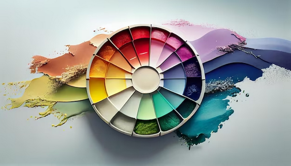
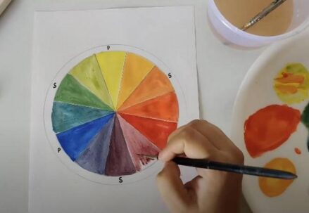
To effectively employ color blocking, it is essential to have a good grasp of the color wheel. The color wheel is a visual representation of colors organized in a circular format. It consists of primary, secondary, and tertiary colors, as well as warm and cool colors. Here is a simplified breakdown:
- Primary Colors: These are the three fundamental colors – red, blue, and yellow – that cannot be created by mixing other colors;
- Secondary Colors: Secondary colors result from mixing two primary colors:
| Primary Color 1 | Primary Color 2 | Resulting Secondary Color |
| Red | Blue | Purple |
| Red | Yellow | Orange |
| Blue | Yellow | Green |
- Tertiary Colors: Tertiary colors are created by mixing a primary color with a neighboring secondary color, resulting in shades like red-orange, yellow-green, etc;
- Warm Colors: Warm colors, such as red, orange, and yellow, evoke feelings of energy and warmth;
- Cool Colors: Cool colors, such as blue, green, and purple, convey a sense of calmness and serenity.
Complementary Colors in Color Blocking

One of the fundamental principles of color blocking is the use of complementary colors. Complementary colors are pairs of colors that are located opposite each other on the color wheel. These combinations create a high level of contrast and can make your designs visually striking. Some common complementary pairs include:
- Red and Green;
- Blue and Orange;
- Yellow and Purple.
When applied strategically, complementary colors can produce dynamic and vibrant designs that capture attention. For instance, using red and green in color blocking can create a strong contrast that is both visually appealing and attention-grabbing.
Subtle Contrasts for Elegance
While complementary colors are known for their bold contrasts, it’s important to note that subtler contrasts can also be incredibly effective. Subtle contrasts involve using colors that are closer to each other on the color wheel, such as analogous colors. Analogous colors share similar hues and can create a harmonious and elegant look. For example, combining shades of blue and purple in a color block design can convey a sense of sophistication and tranquility.
Color Blocking in Logo Design
Logos serve as a brand’s visual identity, making color selection a critical element in logo design. Some of the most iconic logos in the world utilize color blocking to their advantage. Consider the following famous examples:
- McDonald’s: The combination of red and yellow in the McDonald’s logo creates a striking and memorable design that is instantly recognizable;
- Coca-Cola: The use of red as the primary color in the Coca-Cola logo conveys energy and excitement, making it a globally recognizable brand;
- Facebook: Facebook’s iconic blue and white color scheme exudes trustworthiness and reliability.
In logo design, color blocking simplifies the design while making it more impactful and memorable. The key is to choose colors that align with your brand’s personality and values.
Color Blocking in Web Design
In the realm of web design, color blocking plays a crucial role in enhancing the user experience and guiding visitors through a website. Beyond aesthetics, color blocking is a functional tool for highlighting essential information and making navigation intuitive.
Benefits of Color Blocking in Web Design:
- Visual Hierarchy: By using color blocks, you can establish a clear visual hierarchy on a webpage. Important elements, such as call-to-action buttons or headlines, can be highlighted using contrasting colors, drawing users’ attention;
- Readability: Color blocking can improve text readability by ensuring that text stands out from the background. For instance, dark text on a light color block background enhances readability;
- Branding Consistency: Consistent use of color blocks in web design reinforces brand identity. Visitors can associate specific colors with your brand, making it more memorable;
- Navigation: Color-coded sections or categories can make website navigation more intuitive. Users can quickly identify different sections or products based on color cues.
Impact on Viewer Psychology
Understanding the psychological impact of colors is essential when delving into the world of color blocking. Colors have the power to evoke emotions and feelings in viewers, and leveraging this knowledge can greatly enhance your design’s effectiveness.
The Psychology of Colors:
- Red: Red is associated with passion, energy, and urgency. It can create a sense of excitement and is often used for attention-grabbing elements;
- Blue: Blue is known for its calming and trustworthy qualities. It evokes a sense of stability and reliability, making it a popular choice in corporate branding;
- Yellow: Yellow is associated with positivity and happiness. It can convey warmth and optimism, making it suitable for brands aiming to exude friendliness;
- Green: Green symbolizes growth, nature, and health. It is often used in designs related to sustainability and wellness;
- Purple: Purple conveys luxury, creativity, and sophistication. It’s a popular choice for brands looking to showcase elegance;
- Orange: Orange is energetic and vibrant, often representing enthusiasm and creativity. It can be used to add a lively touch to designs;
- Black: Black is associated with sophistication and formality. It can create a sense of luxury but should be used sparingly to avoid overwhelming designs;
- White: White signifies purity, simplicity, and cleanliness. It is commonly used as a background color to enhance readability.
By strategically selecting colors based on their psychological impact, color blocking can effectively communicate the desired message to viewers, eliciting specific emotional responses and enhancing the overall user experience.
Challenges in Color Blocking
While color blocking offers numerous advantages in design, it is not without its challenges. Overcoming these obstacles is crucial to creating visually appealing and functional designs. Here are some common challenges and strategies to address them:
| Aspect | Challenge | Solution |
| Finding the Right Balance | Achieving a harmonious balance between colors can be difficult, with too much contrast being overwhelming and too little making the design appear dull. | Experiment with different color combinations and test their visual impact. Aim for a balance that maintains interest without causing visual fatigue. |
| Ensuring Readability | Poor color choices can render text or content difficult to read against the background. | Use high-contrast color combinations for text and background to ensure readability. Conduct user testing to check readability across various devices. |
| Maintaining Brand Consistency | Consistency in color usage is crucial for brand recognition, but color blocking can sometimes stray from established brand colors. | Select color palettes that align with the brand’s identity. Use brand colors strategically within color blocks to maintain consistency while exploring new possibilities. |
Tools and Resources for Color Blocking

To navigate the intricacies of color blocking effectively, designers can utilize a range of tools and resources that streamline the process and enhance creativity. Here are some valuable resources:
Color Palette Generators
Color palette generators are indispensable for designers seeking to create harmonious and visually appealing color combinations. These tools help you explore, experiment, and fine-tune your color choices. Here are some notable options:
| Tool | Description |
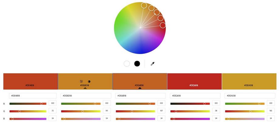
| Adobe Color Wheel | This web-based tool from Adobe offers a user-friendly interface for creating custom color palettes based on color theory principles. It also provides access to thousands of user-generated color schemes. |
| Coolors | Coolors is a versatile color scheme generator that allows you to create your own palettes or explore a vast collection of pre-made palettes. It offers seamless integration with design software and provides export options for various formats. |
Graphic Design Software
Graphic design software is the cornerstone of any designer’s toolkit. These robust platforms enable you to bring your color-blocking ideas to life. Here are some widely used options:
| Software | Description |
| Adobe Photoshop | Adobe Photoshop is an industry-standard raster graphics editor that provides extensive features for manipulating and experimenting with colors. It offers powerful tools for creating intricate color block designs and offers precise color control. |
| Adobe Illustrator | Illustrator is a vector graphics editor by Adobe, ideal for creating scalable color block designs. It excels in precision and allows designers to work with vector shapes and paths, making it an excellent choice for logo design and other intricate projects. |
| Canva | Canva is an online graphic design platform that caters to both beginners and professionals. It offers a user-friendly interface with drag-and-drop functionality, making it accessible for creating color block designs without extensive design expertise. |
Color Psychology References
Understanding the psychological impact of colors is crucial for effective color blocking. References, both online and in print, provide insights into how colors influence emotions and perceptions. Here are some recommended resources:
- Books: Explore books like “The Elements of Color” by Johannes Itten and “Color Psychology and Color Therapy” by Faber Birren to delve deeper into the psychology of colors;
- Online Resources: Websites like Psychology of Color, ColorMatters.com, and Smashing Magazine’s articles on color psychology offer valuable insights and practical tips.
User Testing Platforms
Feedback from real users is invaluable in refining color block designs to maximize their impact. User testing platforms allow designers to gather feedback from a target audience. Here are two prominent options:
| Platform | Description |
| UsabilityHub | UsabilityHub offers various testing options, including preference tests and click tests, which can be used to gather feedback on color schemes and the overall user experience. Designers can target specific demographics to ensure relevance. |
| UserTesting.com | UserTesting.com allows you to conduct usability studies and receive video feedback from real users. This platform provides an in-depth understanding of how users interact with color-blocked designs, helping you make data-driven decisions. |
Case Studies: Successful Color Blocking
Case Study 1: Coca-Cola’s Iconic Red and White
Coca-Cola, an iconic global brand, has masterfully harnessed the power of color blocking through its unwavering commitment to the classic combination of red and white. This enduring color scheme has played an instrumental role in shaping the brand’s identity and worldwide recognition.
- Brand Recognition: Coca-Cola’s bold and unswerving use of red and white color blocks has consistently captured the attention of consumers, establishing an indomitable brand presence;
- Consistency: The brand’s steadfast adherence to these colors over decades has fostered unwavering loyalty and instantaneous recognition among consumers worldwide;
- Simplicity: The sheer simplicity of the color scheme conveys a timeless quality, transcending generational boundaries and rendering the brand universally relatable.
Case Study 2: Apple’s Minimalistic Mastery
Apple Inc., synonymous with minimalist design and innovation, has harnessed color blocking to craft an aura of sophistication around its products. The use of minimalistic color blocks, often centered around black and white, has become a hallmark of Apple’s visual identity.
- Elegance: Apple’s strategic choice of a limited color palette exudes an air of elegance and luxury, appealing to a discerning and premium consumer base;
- User-Friendly: The simplicity inherent in color blocking aligns seamlessly with the user-friendly nature of Apple’s products, emphasizing ease of use and accessibility;
- Memorability: The distinctiveness of Apple’s color scheme renders its products instantly recognizable in the competitive marketplace.
Case Study 3: Google’s Vibrant Colorful World
Google, a tech giant with a global presence, employs color blocking to infuse vibrancy into its brand. It employs a diverse and dynamic color palette in its various products and services, reflecting its multifaceted nature.
- Versatility: Google’s approach to color blocking showcases the versatility of the technique. It uses color to differentiate its products while maintaining a cohesive brand image;
- Innovation: The ever-evolving nature of Google’s color palette reflects the company’s commitment to innovation and staying at the forefront of technology;
- Accessibility: Google’s use of color takes into account accessibility considerations, ensuring that its products are user-friendly and inclusive.
Tips for Beginners: Navigating the Color Blocking Universe
For those new to the captivating world of color blocking in graphic design, here are invaluable tips to embark on this creative journey:
- Begin with Basic Color Schemes: Start your exploration by delving into fundamental color schemes like complementary, analogous, or triadic colors. These provide a solid foundation for mastering color theory;
- Experiment with Combinations: Embrace experimentation by trying out different color combinations. Explore contrasting and harmonious pairings to understand their visual impact and emotional resonance;
- Make Bold Choices: The beauty of color blocking lies in its capacity for bold and audacious choices. Do not hesitate to use vibrant or contrasting colors to craft attention-grabbing designs that leave a lasting impression;
- Practice Regularly: As with any skill, practice is the key to mastery. Dedicate time to honing your color-blocking skills, gradually building confidence and proficiency through consistent practice.
The Future of Color Blocking in Design: A Glimpse Beyond the Horizon
As we cast our gaze into the future of graphic design, it is abundantly clear that color blocking will continue to hold a prominent position. Here are insights into the forthcoming trends and possibilities for color blocking:
- Integration of Technology: The advent of cutting-edge technologies like augmented reality and interactive design promises to open new vistas of creativity for color blocking applications. Designers will have the opportunity to engage audiences on a more profound level through immersive experiences;
- Sustainability: In an era of heightened environmental awareness, color blocking will be employed to convey eco-friendly messages. Brands will leverage color to promote sustainable products and practices, forging stronger connections with environmentally-conscious consumers;
- Personalization: The rise of personalization in design will see color blocking playing a pivotal role in crafting tailored experiences for individuals. Brands will use color to create customized interactions that resonate with each consumer’s unique preferences and values.
Conclusion
Color blocking in graphic design is more than just a trend; it’s a powerful tool for communication and expression. By understanding its principles and effectively applying them, you can create designs that are not only visually stunning but also emotionally resonant. So go ahead, block some colors, and watch your designs come to life!
FAQ
1. What is color blocking in graphic design?
Color blocking in graphic design involves using bold, distinct blocks of color to create eye-catching and harmonious designs.
2. How do I choose colors for color blocking?
Select colors based on the color wheel, considering contrasts and complementary colors to create a dynamic effect.
3. Can color blocking be used in both print and digital media?
Yes, color blocking is versatile and can be effectively used in both print and digital media.
4. What should I avoid in color blocking?
Avoid using too many colors or colors that clash, as this can create a confusing and unappealing design.
5. How does color blocking impact the viewer’s psychology?
Color blocking can evoke different emotions and feelings, depending on the colors used, and can significantly impact a viewer’s perception of the design.


